
TL;DR
Preemptive Image Sizing ensures every image on your site includes accurate height and width values before rendering. This prevents layout shifts during load and contributes to a stable, visually polished browsing experience—especially on mobile. It’s a key part of improving Core Web Vitals, particularly Cumulative Layout Shift (CLS).
The average website page on desktop has around 56 images, categorizing it as visual-heavy.
While this is good news for aesthetics and brand purposes, it also poses many user experience risks. For example, when images load without defined dimensions, the page jumps. Text moves, buttons slide, and users lose their place.
That’s layout shift—and it’s a silent killer of seamless browsing.
Preemptive Image Sizing solves this. Let’s explore how this feature works, when it matters for fast WordPress sites, and how NitroPack fully automates it.
What Is Preemptive Image Sizing?
When your browser encounters an image tag without width and height attributes, it doesn’t know how much space the image will occupy.
So it loads surrounding content first, and once the image finishes downloading, it forces everything around it to move.
That movement is measured by Cumulative Layout Shift (CLS) — one of Google’s Core Web Vitals metrics.

Preemptive Image Sizing works by scanning your site’s HTML and automatically injecting the correct size attributes (width and height) before the browser starts rendering. This ensures:
- The correct space is reserved
- No layout shifts occur when images load
- The overall page experience remains smooth and stable
This includes:
- Product photos
- Blog post feature images
- Hero visuals
- Gallery and inline content
- Responsive images across all devices
Test NitroPack yourself

With vs Without Preemptive Image Sizing (Example)
Without proper image dimensions, your page becomes unpredictable.
Elements jump around, buttons shift, and content gets pushed mid-scroll—all because the browser is guessing how much space each image will take. This creates a jarring experience for users and tanks your CLS score.
Preemptive Image Sizing eliminates that guesswork by reserving the exact space for every image before it loads. The result? A smoother, more stable page during browsing.
| Scenario | Without Preemptive Sizing | With Preemptive Sizing |
| Homepage hero image | Text shifts down as image loads | Space reserved; text stays in place |
| Product listing grid | Uneven gaps and alignment as images appear | Seamless, clean grid on load |
| Blog with inline visuals | Paragraphs jump around during image render | Reading experience remains stable |
| Mobile view on slow network | Layout collapses and rebuilds during scroll | Predictable layout across devices |
Why Is Preemptive Image Sizing Important?
If your content jumps during load, users notice—and so does Google.
Here’s why Preemptive Sizing is a must-have:
- Fixes Cumulative Layout Shift (CLS): CLS is one of the most critical Core Web Vitals, and improper image sizing is a top offender.
- Stabilizes mobile rendering: Prevents shifting content on small screens, where even minor changes feel jarring.
- Improves perceived performance: A stable layout feels faster, even if images load later.
- Enhances UX and SEO: A better visual experience leads to longer sessions and higher rankings.
Preemptive Image Sizing directly addresses several PageSpeed Insights (PSI) score issues:
- Image elements do not have explicit width and height – Resolved automatically
- Avoid large layout shifts – Helps optimize your CLS score
- Ensure text remains visible during webfont load – Supports layout stability during font swaps
- Serve images in next-gen formats – Combines perfectly with NitroPack’s WebP optimization
Preemptive Image Sizing in NitroPack Explained
NitroPack’s implementation is automated, reliable, and maintenance-free.
Once enabled in your optimization settings, NitroPack:
- Detects all image elements
- Calculates and injects the correct width and height values
- Adapts sizing for responsive behavior across devices
- Works alongside image compression and WebP generation
- Keeps your original HTML intact—no template changes required
This way, layout shifts are prevented before they happen—without breaking designs or requiring custom development.
| Use Case | NitroPack Benefit |
| Ecommerce store with dynamic product images | Clean, stable grid with no reflow on load |
| Blog using large featured visuals | No paragraph jumps or reading disruption |
| Homepage with image carousel | Smooth transitions with no layout instability |
| Responsive galleries | Images resize cleanly across viewports |
NitroPack vs Manual Preemptive Sizing
Doing this manually means inspecting each image, calculating its rendered size, and adding width + height to every tag. On large or dynamic sites, that’s not scalable.
NitroPack automates it all, in real time.
| Feature | Manual Setup | NitroPack Preemptive Sizing |
| Requires code changes | ✅ Yes | ❌ None |
| Works on dynamic pages | ❌ Difficult | ✅ Automatically |
| Mobile-responsive handling | ⚠️ Needs breakpoints | ✅ Built-in |
| Part of Core Web Vitals strategy | ✅ If done right | ✅ Done for you |
How to Use Preemptive Image Sizing in NitroPack
Getting started is simple:
- Log in to your NitroPack dashboard
- Navigate to Cache Settings >> Images & Media
- Enable Lazy load images
- Check the “Size images preemptively” box
- Save your settings
- Purge your cache
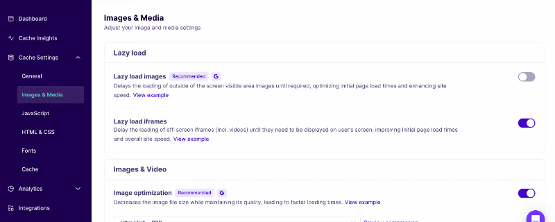
That’s it—NitroPack will begin injecting size attributes and eliminating layout shifts on your site automatically.
Need more help? Check out our Preemptive Image Sizing guide.
Don’t let images break your layout. Fix CLS with NitroPack automatically →
FAQs
What types of images does Preemptive Sizing work with?
All standard <img> tags, including those in carousels, grids, blog content, and hero sections.
Will it break responsive image design?
No—NitroPack calculates and applies sizing in a way that preserves responsiveness and fluid layouts.
Is this the same as lazy loading?
No—Lazy loading delays image loading. Preemptive sizing reserves space before images load to prevent shifts. They work perfectly together.
Do I need to manually add width and height?
No. NitroPack does this automatically across your entire site once the feature is toggled on.