


How To Improve Mobile UX To Speed Up Your Website In 2024
Last updated on Feb 15th, 2024 | 7 min
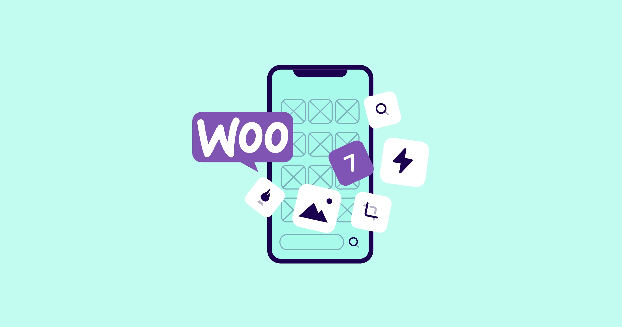
Once you start with NitroPack, you can freely choose your integration platform.


Everything you need to know about
NitroPack features and compatibilities.
Whether you run a blog or
an agency, we have a
partnership opportunity for you!
The place to learn how to
improve your web performance,
how to get the most out of
NitroPack, and what is coming
next to our product.
Mobile is now the most common way to access the internet, and the number of mobile users who shop online continues to grow. In 2017, 58.9% of all retail eCommerce sales worldwide were made on mobile devices, with that share rising to 72.9% or $3.5 trillion in 2021, according to eMarketer (via Statista).
If the UX aspects of your store aren’t optimized for mobile users, such as navigation, speed, and accessibility could be harming your bottom line.
In fact, a Google study showed that 53% of the time, visitors to mobile sites leave a page that takes more than three seconds to load.
Due to this, it’s vital that the mobile user experience (UX) of your WooCommerce store is as positive as possible.
Don’t worry, though, as we’ll cover in this guide, there are some easy ways to improve the mobile UX of your WooCommerce store. From adopting a few tools to redesigning your entire store, there’s a lot you can do to make it more user-friendly for mobile users.
As mentioned, the share of eCommerce transactions carried out on mobile devices continues to grow. According to Business Insider, they increased by 20 percent from 2020 to 2021, hitting $359.32 billion.

However, if your store isn’t optimized for mobile users, you could see a decline in sales.
For example, one usability study found that a checkout process that was too long or complicated was responsible for 17 percent of shopping cart abandonments. Another study, this time by Google, found that a faster mobile experience leads to a lower bounce rate. Furthermore, the slower your site, the lower the conversion rate.

So while mobile eCommerce is increasing, if your site isn’t optimized for these users, you could be missing out.
Now that you know how important it is to make your store mobile-friendly, here are seven ways to improve the mobile UX of your WooCommerce store.
Starting your WooCommerce store on solid foundations by implementing a mobile-first design from the outset is highly recommended. Creating your store with a mobile-friendly theme is much easier than trying to improve the UX of a design that wasn’t built with mobile users in mind.
However, most people reading this guide will probably already have their store up and running. If that’s the case, don’t worry, there’s plenty of advice in this article that will help you improve your store's mobile UX in other ways.
But if you haven’t yet launched your store, choosing a mobile-first or highly mobile-optimized theme or design could prevent a lot of headaches down the road.
Thankfully, there are some excellent themes for WooCommerce that have been built with mobile audiences in mind. Of course, these themes don’t overlook desktop users. However, mobile users should enjoy an experience that’s highly optimized for them.
So if you’re yet to start, go with a theme or design that’s highly mobile-friendly.
If you’ve already launched your store with a design that’s not as mobile-friendly as it could be, all is not lost.
One of the great things about WordPress and WooCommerce is that you can switch themes at any time.
However, while the process of uploading and activating a new theme is very straightforward, the implications for your store could be huge.
Perhaps the biggest one is that a change in design could confuse your audience. Your branding could also be disrupted, depending on how radical the change in design is. Changing themes could also break some aspects of your store, especially if you’ve carried out much customization work.
Overall, changing themes on a store that’s up and running isn’t something that should be entered into lightly. However, if your current design isn’t mobile-friendly, your store’s due a refresh, or you’ve yet to build your audience, it might be something to seriously think about.
Whether you change themes or not, there’s still a lot more you can do to improve the mobile UX of your WooCommerce store.
Another option is ensuring that your existing content and user interface are optimized for mobile users.
One area to focus on is optimizing images so that there are alternative versions for visitors accessing your store on devices with smaller screens. This should make the pages easier to view and speed up loading times. Choosing the best image formats is essential, too.
Implementing adaptive image sizing is something else to consider. Doing so prevents images from overflowing their containers – something that can be especially annoying on mobile.
Something else you can do is adjust your mobile navigation system so that it makes it as easy as possible for smartphone users to access the most important pages or functions of your store. Some elements will be consistent among most stores, such as the search tool and the shopping cart.
However, it’s well worth checking your analytics to see which pages are most accessed by your customers. Then, use that information to adjust your menus to make those pages easy to access. Also, Google recommends adding links to the main product categories to your store's homepage. Some themes include the necessary functionality to create a mobile-only navigation system. If yours doesn’t, a free plugin like WP Mobile Menu can help.
If there are any non-essential items that could be making the mobile UX more frustrating, removing them is a quick win. For example, you might have a video or slider that looks great on the desktop version of your site but doesn’t provide much aside from decoration.
Google found that pages with fewer images created more conversions on mobile. The same Google research also found that fewer page elements have a positive impact on user experience, so simplifying your content is something to consider.

Could you remove images and unnecessary elements entirely, or just deactivate them for mobile users? The same could apply to elaborate background and animation effects.
Even adjusting the colors to make them less distracting on smaller screen devices is worth considering.
Becoming more familiar with what it’s like to use your store on a mobile device, combined with looking at visitor analytics, should give you ideas on what you can do to improve the UX.
Moreover, this ties into the idea that one of the most effective UX practices for mobile apps is getting hands-on with your store yourself. Simple navigation, quick loading times, and a lack of clutter keep things streamlined and boosts conversions. Spend a few moments using your site, and you should spot obvious issues to address.
In addition to optimizing the key pages you identified in the previous step for mobile users, you could also go one step further and create mobile-only versions of those pages.
These pages could be designed for the best UX possible as mobile users would only see them. There would be no need for compromises made for those accessing the content on larger screens.
A free plugin can help you achieve this with WordPress. Once activated on your site, Specific Content For Mobile lets you quickly create a mobile version of the pages on your site.
Think about creating mobile-only versions of your important pages or editing your pages to display certain elements on desktop only. One example of a WordPress page editor that lets you do this is the freemium Elementor plugin.
As well as exploring the mobile UX of your store yourself, you can also employ tools to help.
Google has a free-to-use tool for evaluating mobile sites. While it’s pretty basic, it will give you some information about the mobile UX of your store. For more in-depth analysis, you can connect your site to Google Search Console.
Paid tools, like BrowserStack, can test your store on a range of different devices and browsers as well as let you experience your site at different network speeds and from various locations.
Forms are probably the most important part of your eCommerce store. If they don’t work on mobile or are hard to use, your customers won’t be able to place orders.
Due to their importance, it’s vital that you personally check the UX of key forms on your site. While the underlying form technology, powered by WooCommerce, probably works well enough, a long or complicated checkout process is a top contributor to abandoned carts.
Some practical advice for optimizing forms for mobile includes avoiding multi-column layouts, thinking carefully about labels and placeholders, and removing unnecessary form items, such as clear or reset buttons.
Speeding up your WooCommerce store has many benefits, including better search engine rankings and higher conversion rates. However, faster load times also have a positive impact on mobile UX.

As there are lots you can do to speed up your site, you can start small or go all in.
Some effective options, which we mentioned in our article "5 Easy Ways to Speed up Your WooCommerce Store", include image optimization as well as implementing HTML, CSS, and JavaScript optimization.
Enabling caching and using a content delivery network (CDN) are two more ways you should be able to speed up your store for improved mobile UX with minimal effort.
If you want to put in a bit more work, you could consider changing to a faster web host. Depending on your site's current speed, this might be something that’s worth undertaking as there can be a big difference in performance between hosts. Most premium web hosts, such as Kinsta, provide free website migrations.
As you can see, there’s a lot you can do to improve the mobile UX of your WooCommerce store.
Some are quick and easy, such as installing a plugin like NitroPack to implement image optimization, caching, and a CDN. In contrast, others can be more time-consuming, including redesigning your store, changing to a faster web host, and creating mobile-only versions of your content.
However, as mobile internet usage continues to grow and improving UX can positively affect conversions, doing all you can to make your store as mobile-friendly as possible should be a priority.

Joe is a freelance writer and blogger who specializes in writing about technology, web design, and online marketing.